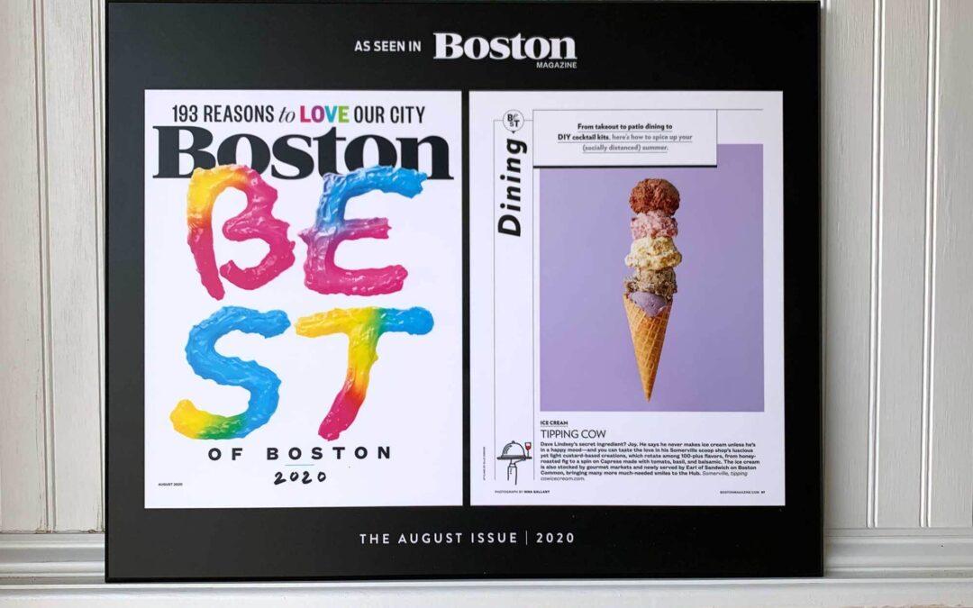
Color-Contrasting Border Adds Bold Look
White-on-Black Framing
Nothing catches the eye quite like contrasting colors. Framed by a matte black background, this white article and cover reprint is sure to pop in any room. While most of our clients opt for white-on-white plaques, this “Best of Boston” award recipient took advantage of our limitless design options to customize their award keepsake. The result? A striking, sophisticated plaque that stands out in any room.
Vibrant Colors
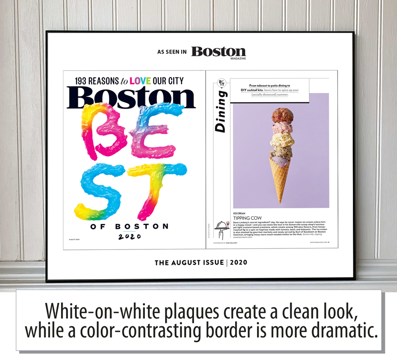 We also love how this white-on-black design shows off the reprint’s vibrant colors. Our Pantone printer uses precise mixtures of ink to reproduce the exact color palette used in each publication. From the playful shades of this “Best of Boston” cover to the perfectly pastel ice-cream scoops, this reprint boasts both style and flair.
Clean or Dramatic?
While the popular white-on-white design choice offers a clean, classic look, we do love the dramatic effect the black background creates. At the end of the day, though, it’s simply a matter of taste. Which style do you prefer?
Get Inspired by Our Gallery
We’re always keeping an eye out for forward-thinking design choices. Browse our gallery to see more of our favorites.
Stay tuned next Wednesday to read our next Revenue Ideas blog!
This is the first installment of Revenue Ideas, a series highlighting our favorite plaque designs and award store tips. This week, we’re taking a look at one of Boston Magazine’s award displays.